Design System
Visual Design Direction
Defining the visual design vision of a cybersecurity platform and establishing foundational elements before building the system.
Role
Senior Designer
Tools
Figma, Miro
Timeline
~3-4 months
Contributions
Visual design exploration and iteration, mood board creation, token discussions and decisions
The Problem
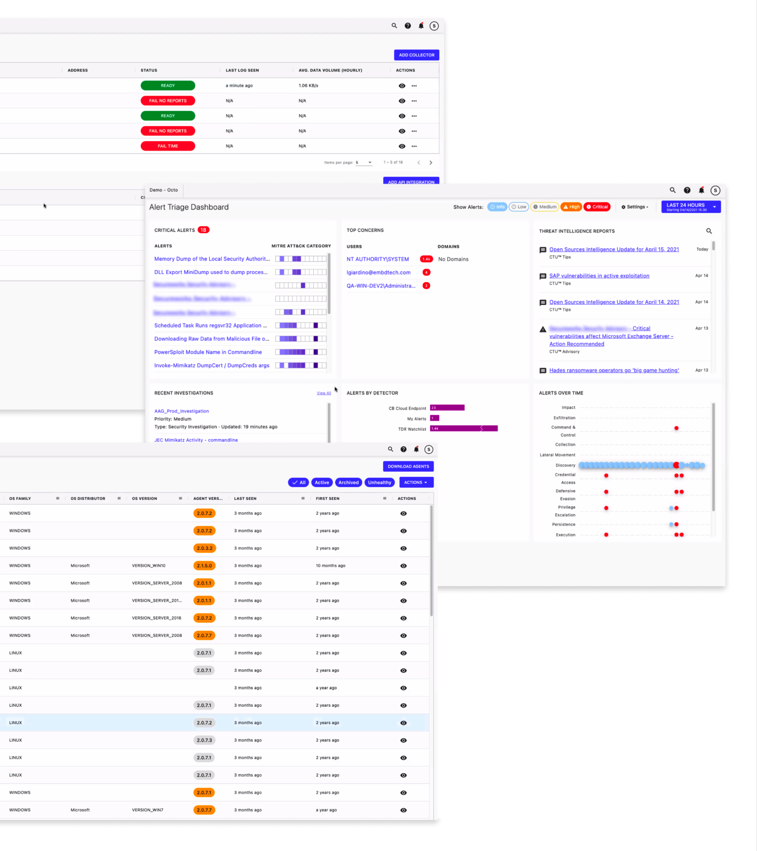
Through stakeholder interviews with product managers, designers, and developers, a theme emerged around inconsistency across the platform’s UI.
After conducting an audit of various user flows, this theme became quickly apparent as these discrepancies surfaced:
Inconsistent visual design of component
Inconsistent usage and behavior of components
What We Heard
For example, sometimes tables will say “Creator,” sometimes they’ll say “Created by,” and sometimes “Username.” This can be confusing.
– Engineer
We have the Figma library… what’s tricky is that what’s in the library doesn’t look like the actual product.
– UX Designer
On certain views, [we] use filter chips but won’t find those in other views. Or certain interactions where a modal may pop up and others where it doesn’t.
– Product Manager
There is a lot of divergence in patterns for the same functions (stepper controls, form layout, calls to action, etc.).
– Research Director
Setting the Mood
Before building the system, we needed to work towards establishing a cohesive visual direction. I co-created moodboards to test design concepts and align with the client on a desired aesthetic for the product.
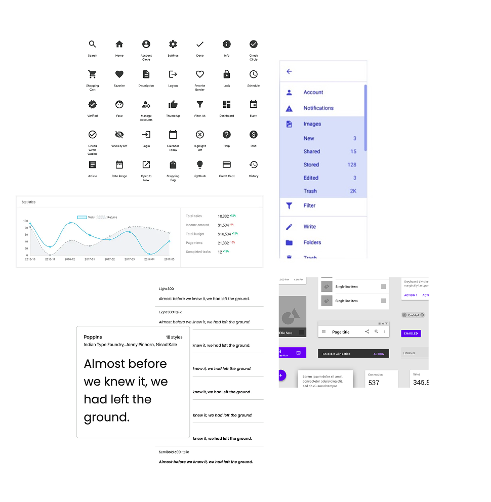
Classic • Clean • Predictable
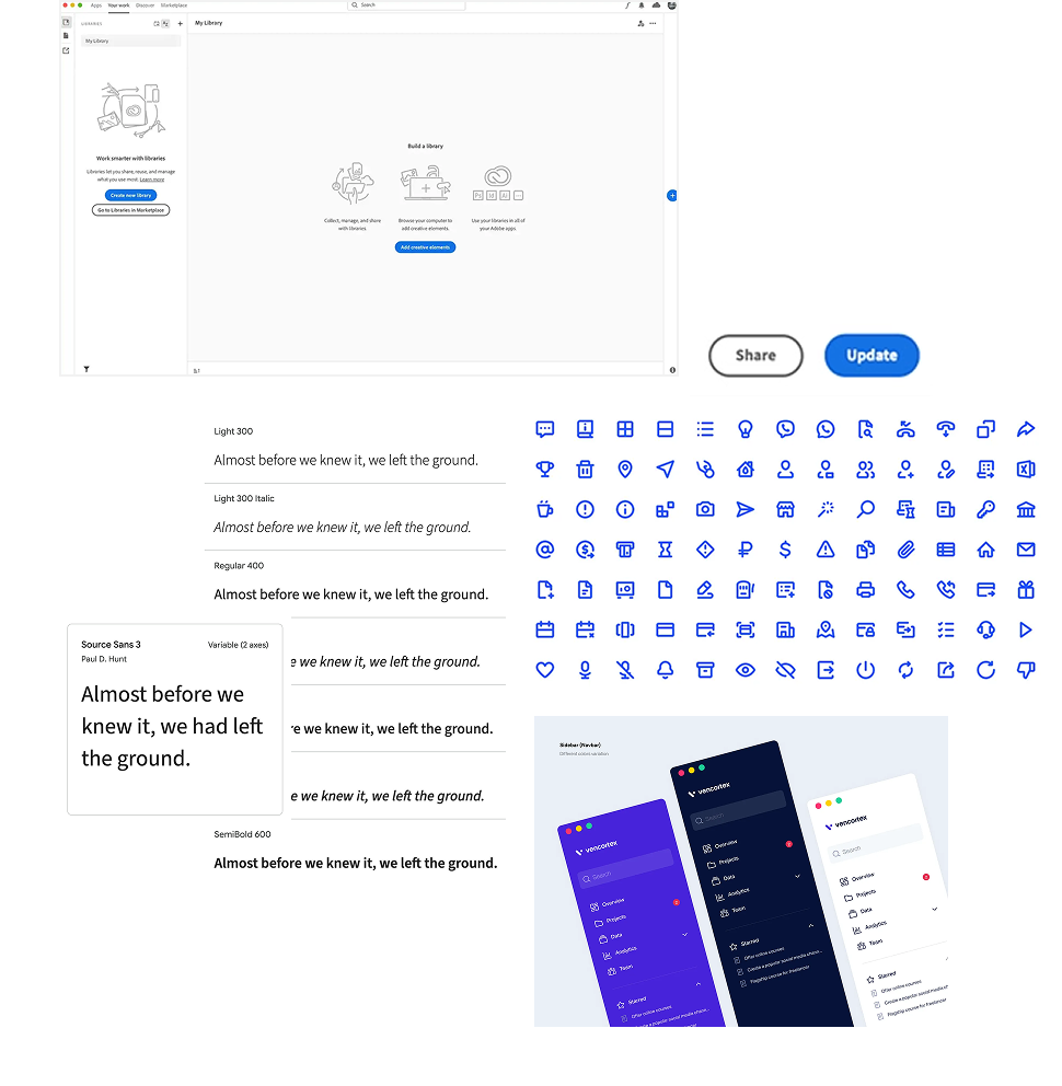
Monotone • Simple • Modern
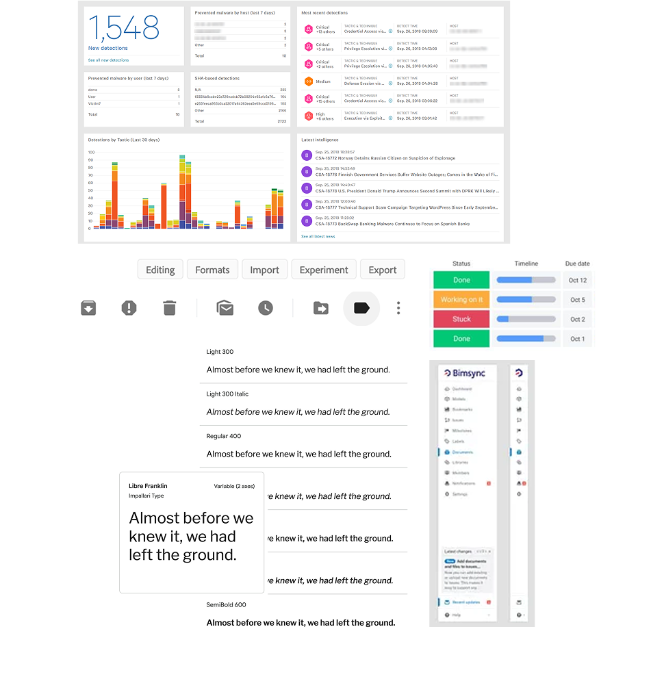
Serious • Classic • Minimal
Iterate, Iterate, Iterate
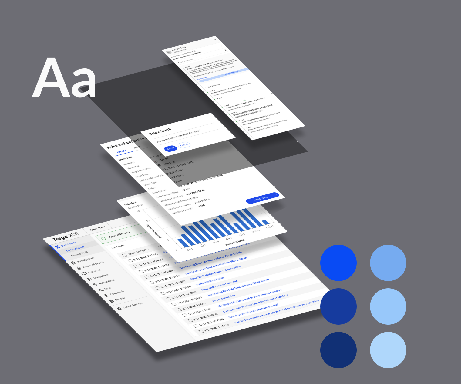
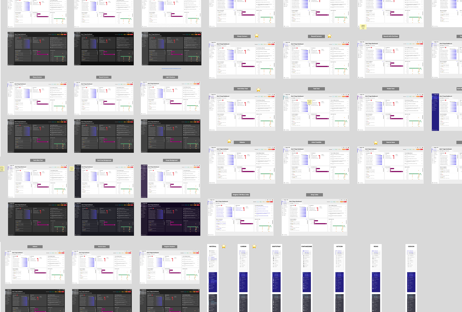
After landing on a theme, I dove deep into rounds of design explorations with the team, analyzing visual elements such as iconography, typography, color, and elevation.
Conversations also began around:
Fonts (Google vs. System)
Color Tokens Naming
Icon sets (Material vs. Carbon)
Spacing & sizing tokens
Color
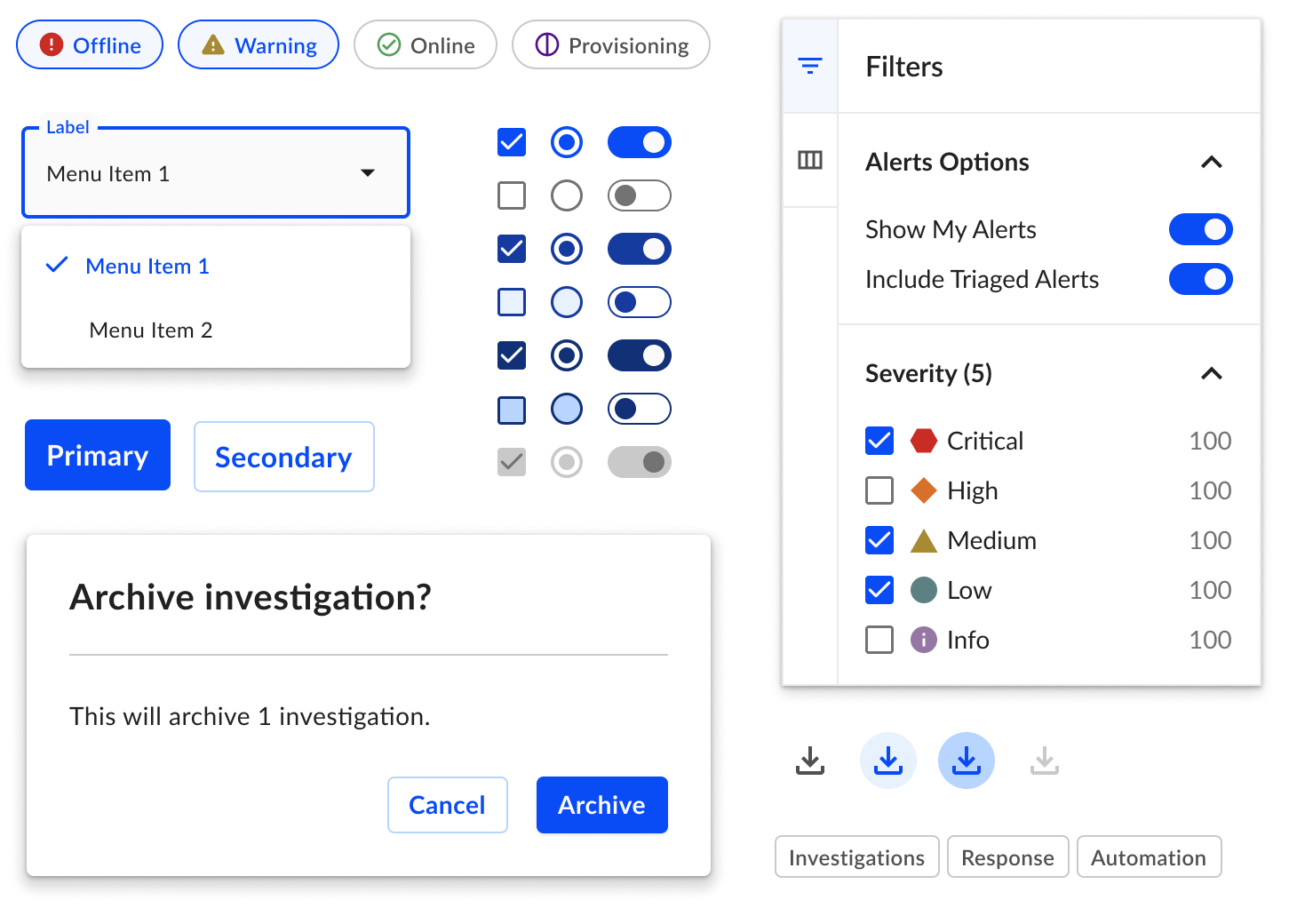
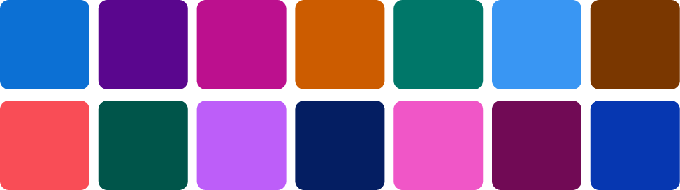
While establishing the platform’s new visual direction, I explored and defined color palettes for various interactive and semantic use cases, accounting for accessibility and compatibility with one another.
Interactive Colors


Semantic Colors – Feedback


Semantic Colors – Alert Severity


Semantic Colors – Code


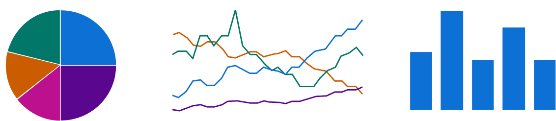
Data Visualization Colors
Other Foundations
Decisions surrounding typography, iconography, and spacing were made considering the information density of the UI. Whether a user is viewing hundreds of alerts within a table, multiple data visualizations on a dashboard, or building an automations playbook, they would be able to navigate and retain information clearly & efficiently.
Typography
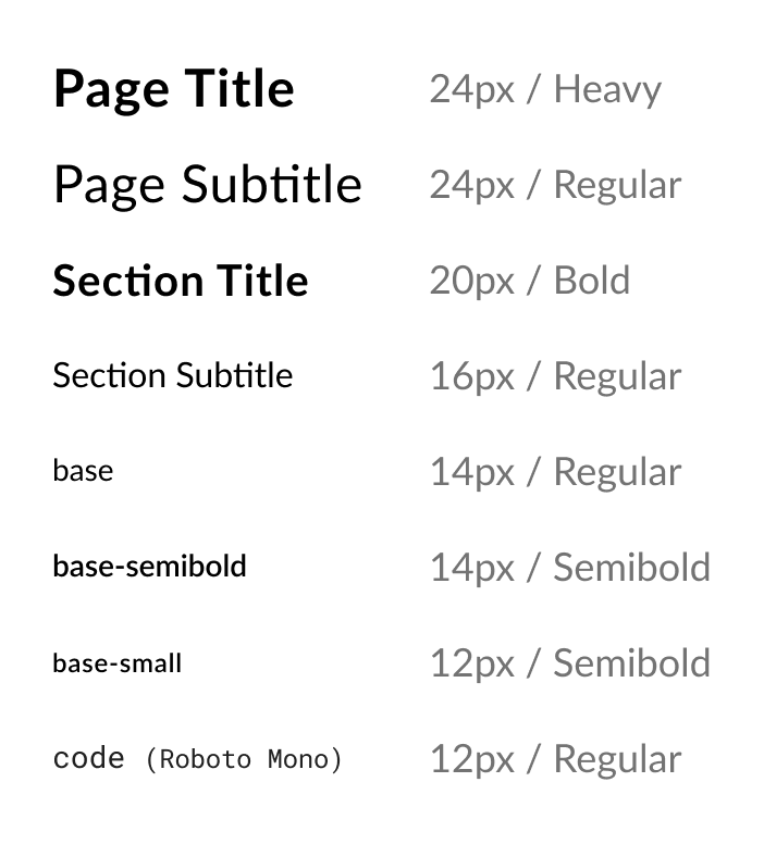
Lato, our primary typeface, supports legibility and space efficiency at large and small sizes.
Iconography
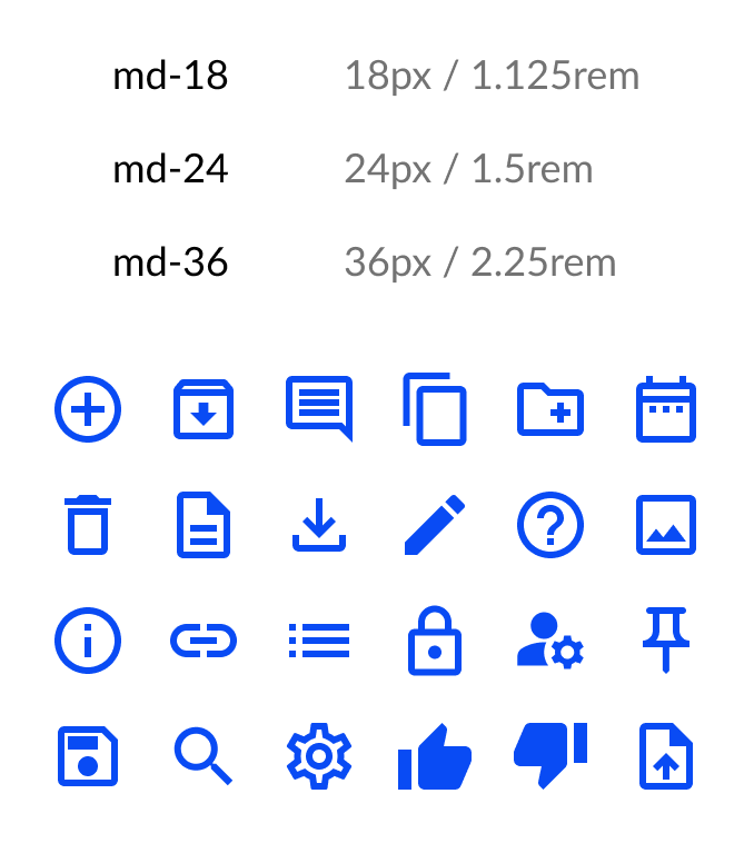
A curated selection of outlined Material icons are used for most cases, with filled icons using sparingly and when appropriate.
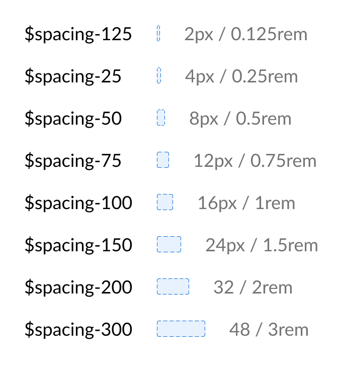
Spacing
Using a 16px/1rem base unit, our spacing scale accounts for a variety of information densities.
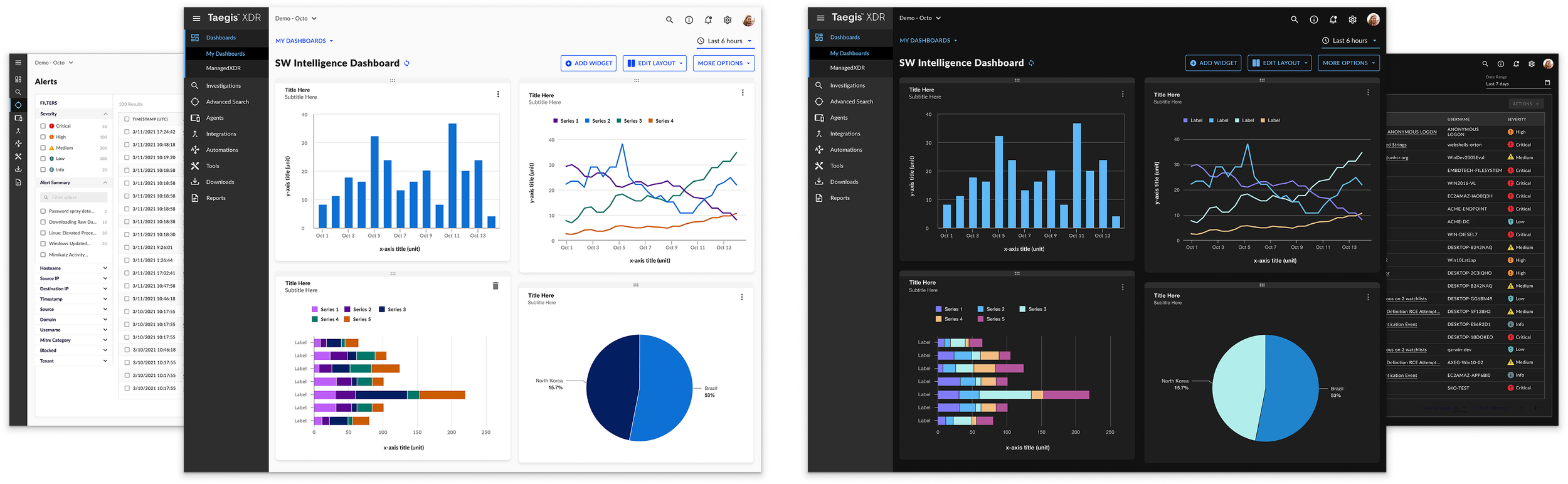
The Official Direction
In embarking on the next phase of building the design system, these are just a few of the key screen designs that would be referenced when building components and patterns.