Design System
Components & Documentation
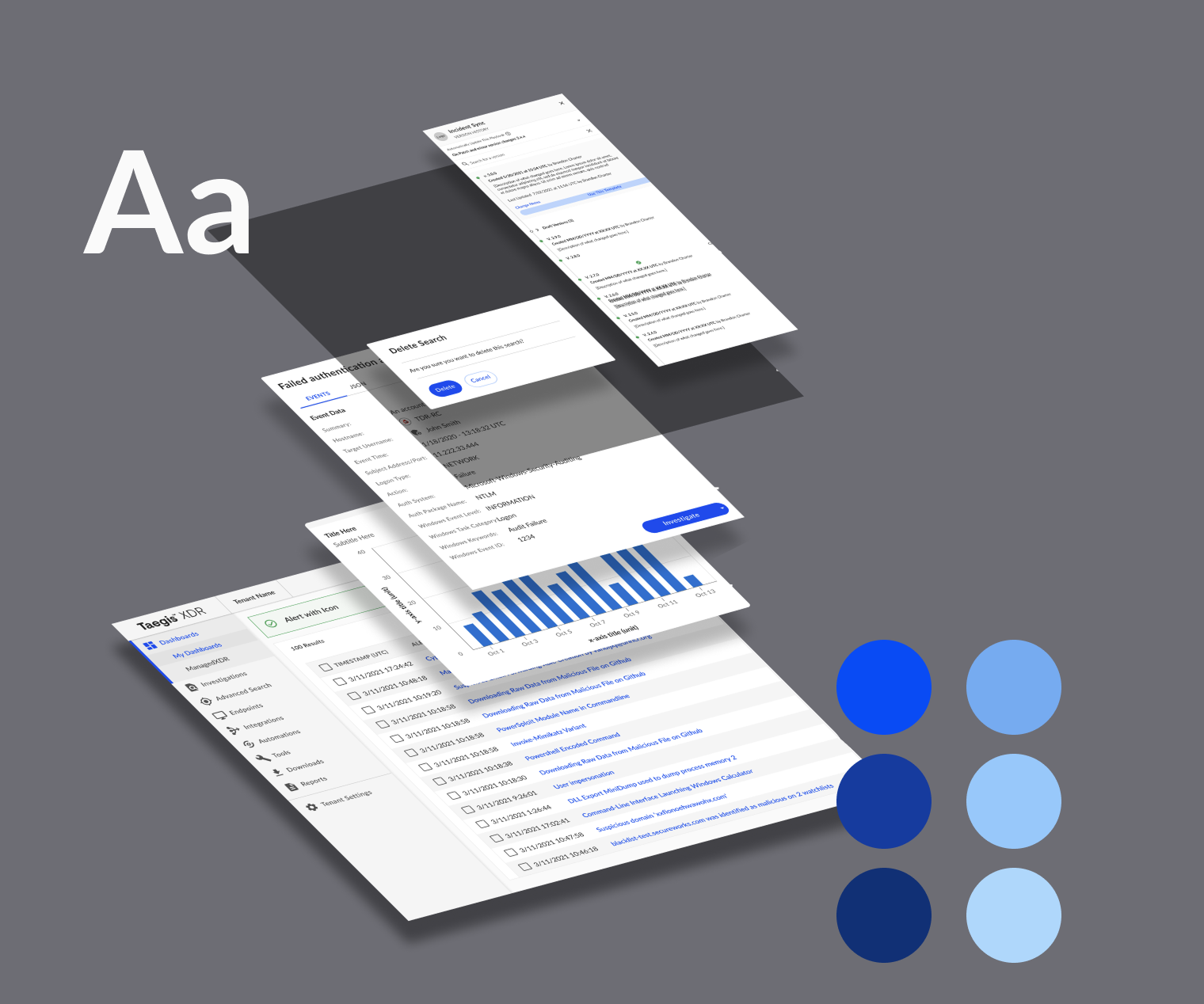
Building a design system for a cybersecurity platform, creating cohesion and efficiency to simplify and accelerate vulnerability triage.
Role
Senior Designer
Tools
Figma, Storybook, Zeroheight, Jira, Miro
Timeline
~14 months
Contributions
Site audit, token and component creation, documentation, training, content management, and tool migration
165
Tokens and styles created, including color palettes for data visualizations and alerts
52
Components designed, from basic buttons and dividers to interactive tables and key value pairs
9
Teams onboarded, including 15 designers and their product and engineering partners
132%
Approximate ROI calculated with 5 years of usage
The Problem
After previous attempts of building a design system, and failing, inconsistency in the platform’s UI was increasing and evident by two themes:
Inconsistent visual design of components
Audits revealed several variations of components such as chips, buttons, etc.

Inconsistent usage and behavior of components
While chips were used to filter in one view, cards were used to filter in another.

How we Built it
Define

Audits were conducted for each component and prioritized, then brought into a requirements gathering session with stakeholders and engineers.
Design

Using an atomic structure, components were designed and iterated upon, involving designers and engineers when needed, while documentation was written in parallel.
Develop

Engineers built component libraries using Storybook. Through live training sessions and office hours, all product teams were informed of new components.
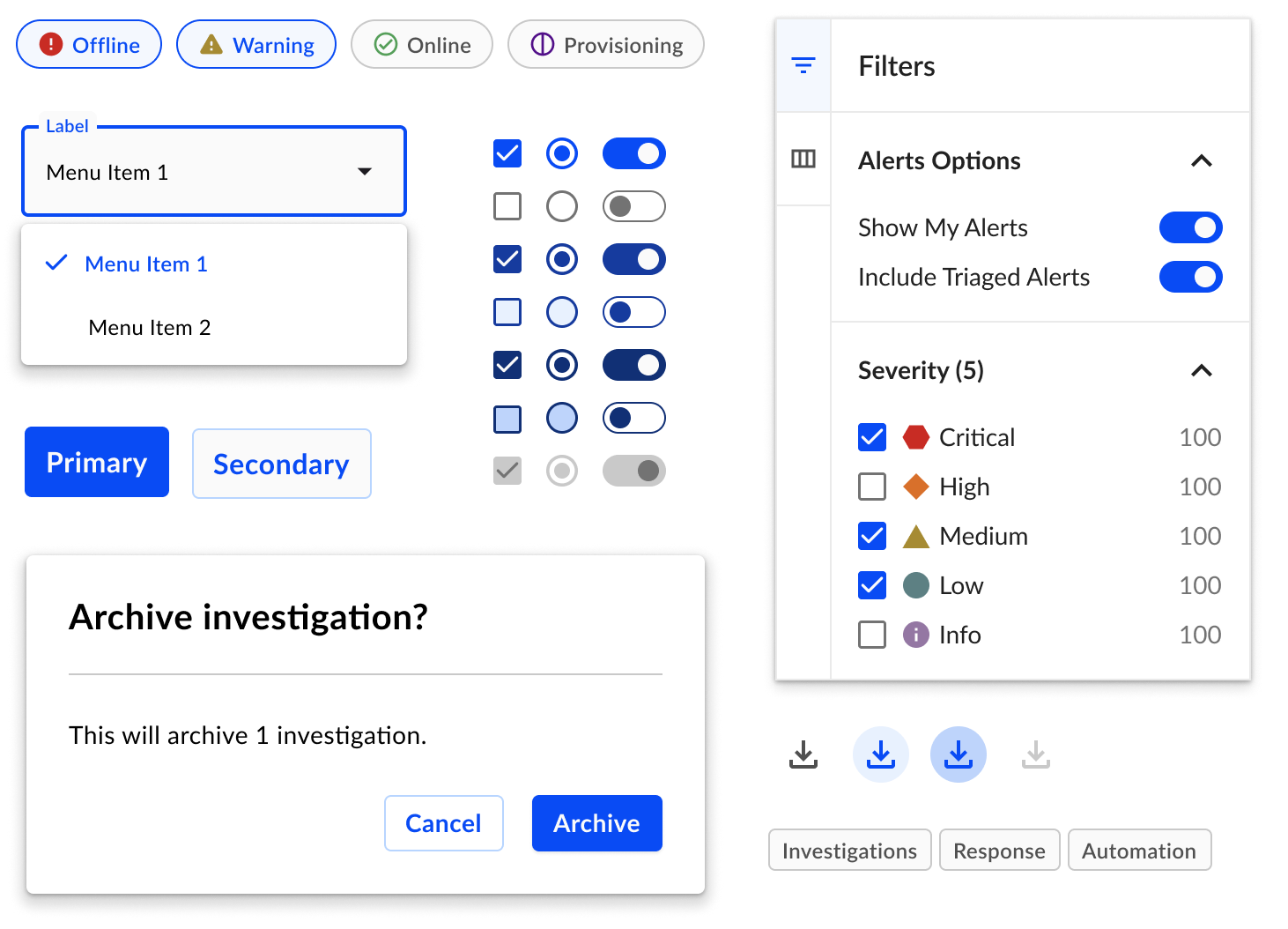
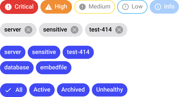
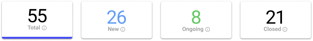
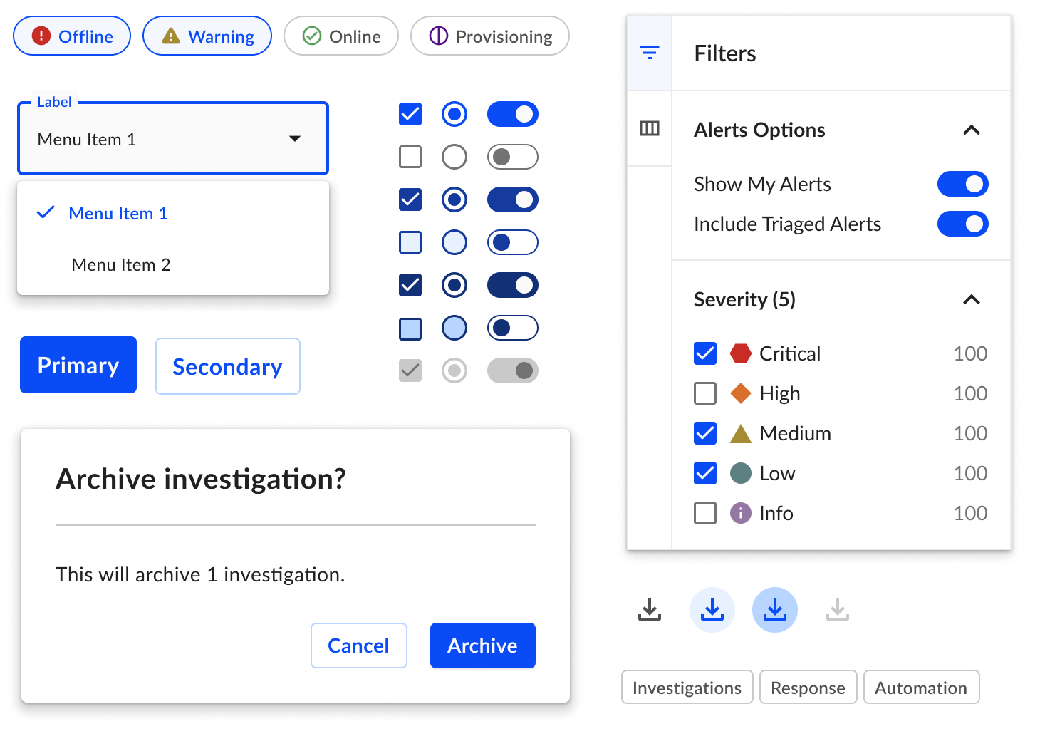
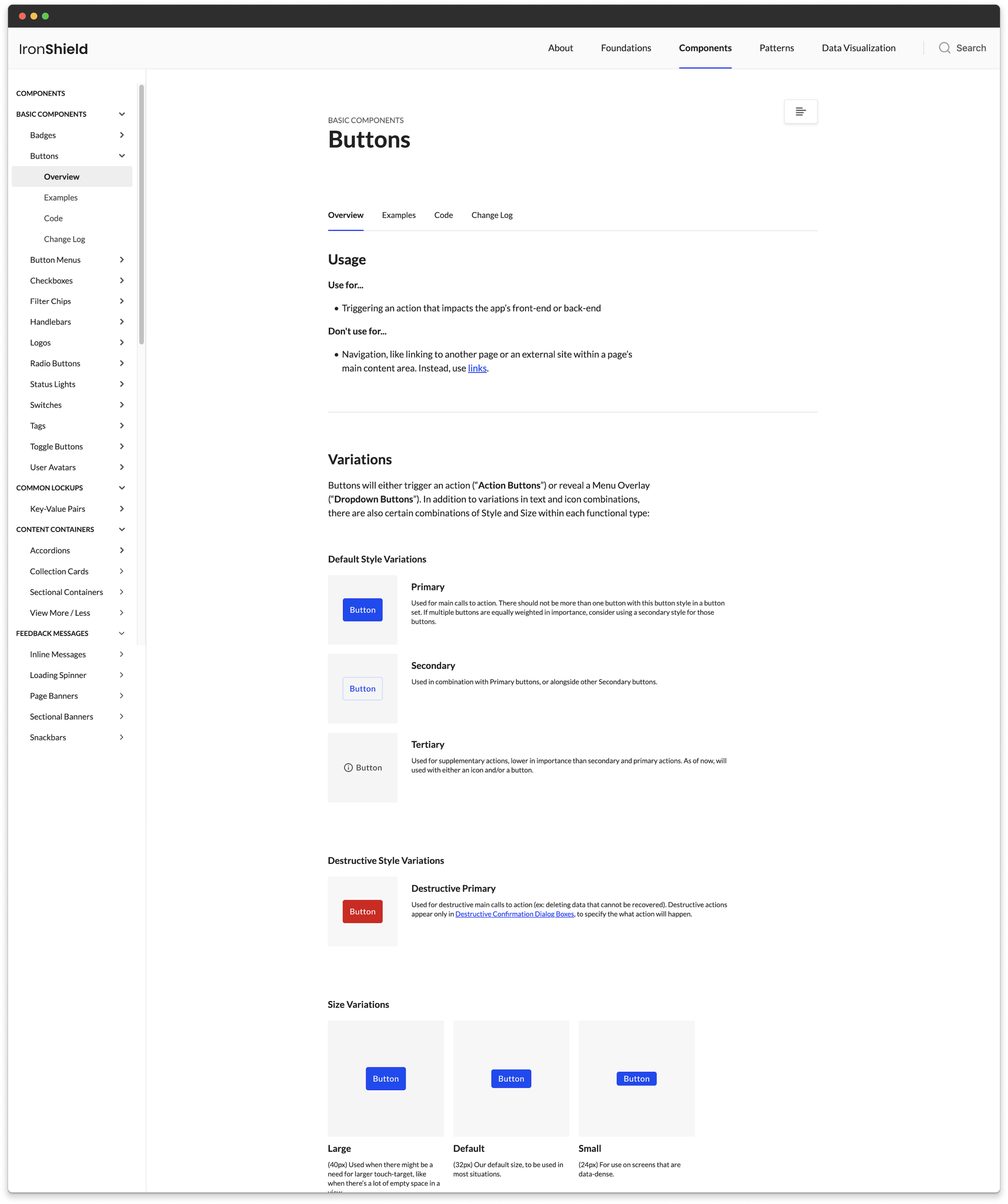
Components
52 components were built in light and dark themes using the base component method. Future updates made to a small set of components are applied to the entire set, increasing efficiency and reducing effort.
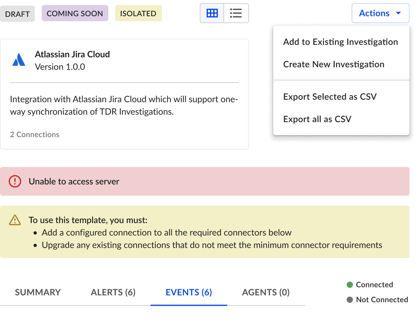
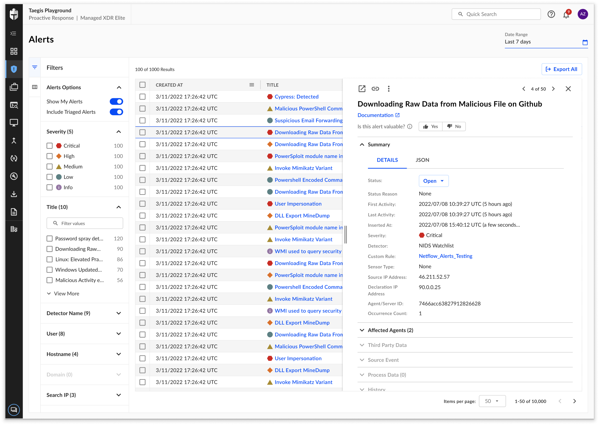
Tables
With tables comprising a large amount of the platform’s interface, I spent much time iterating and defining various UI and functional design decisions such as:
Defining capabilities of simple tables versus interactive tables
Table UI and interaction states
Tables actions versus row actions
Detail panel (shown right) with handlebar interaction
Strategy for building table components in Figma
Training
I spearheaded a training initiative for the client’s design team by creating outlines for the sessions, designing the content, and orchestrating speaking parts and Figma demos.
These trainings took place in three parts and focused on the following:
Educate on design system usage
Overview of library, guidelines, and how to use components.
Address skill gaps in design tools
Educate on usage of auto layout within components and page layouts.
Improve design efficiency
Demostrate how to work with interactive components and smart animate. Advise on how to effectively use prototyping for research and design reviews.

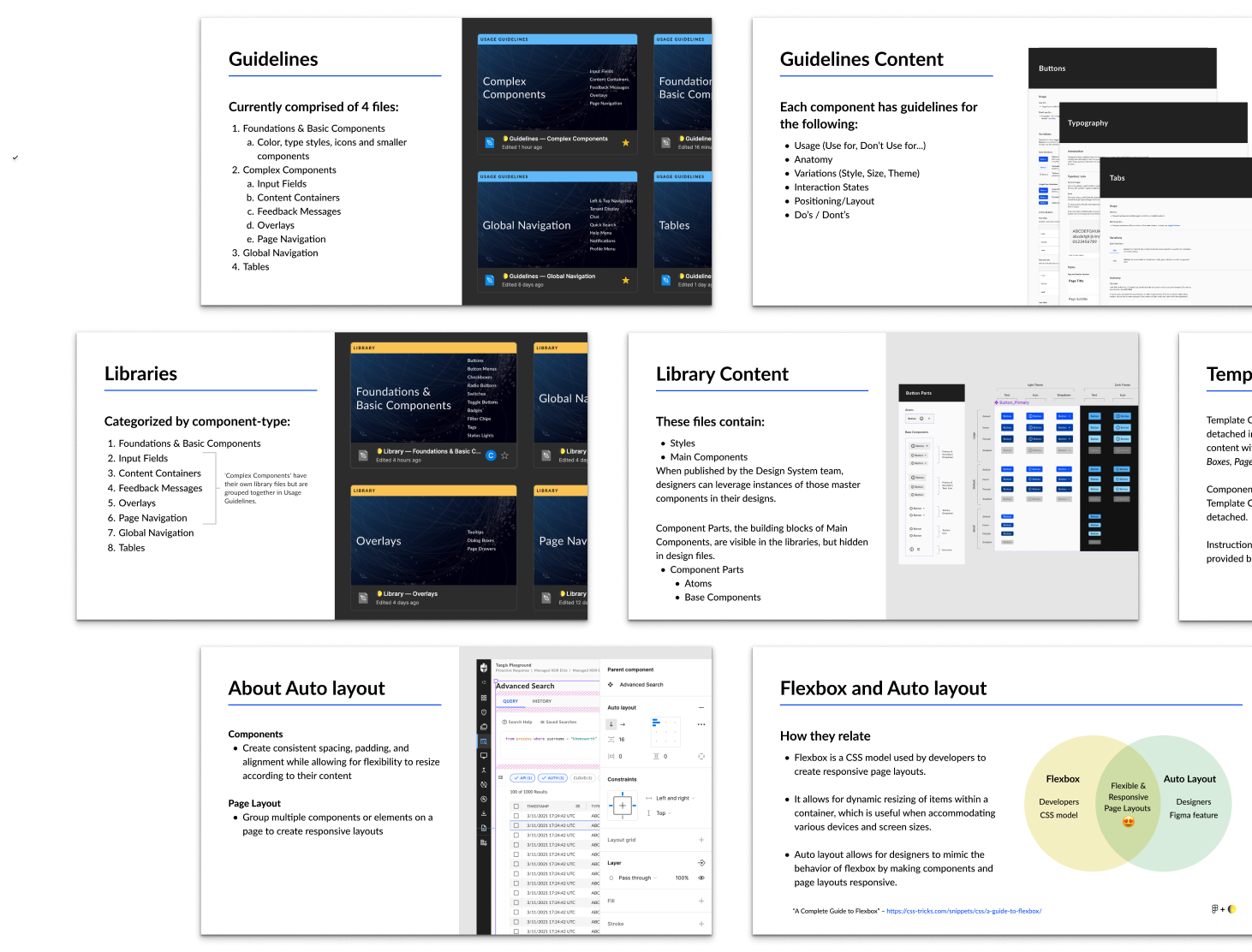
Documentation
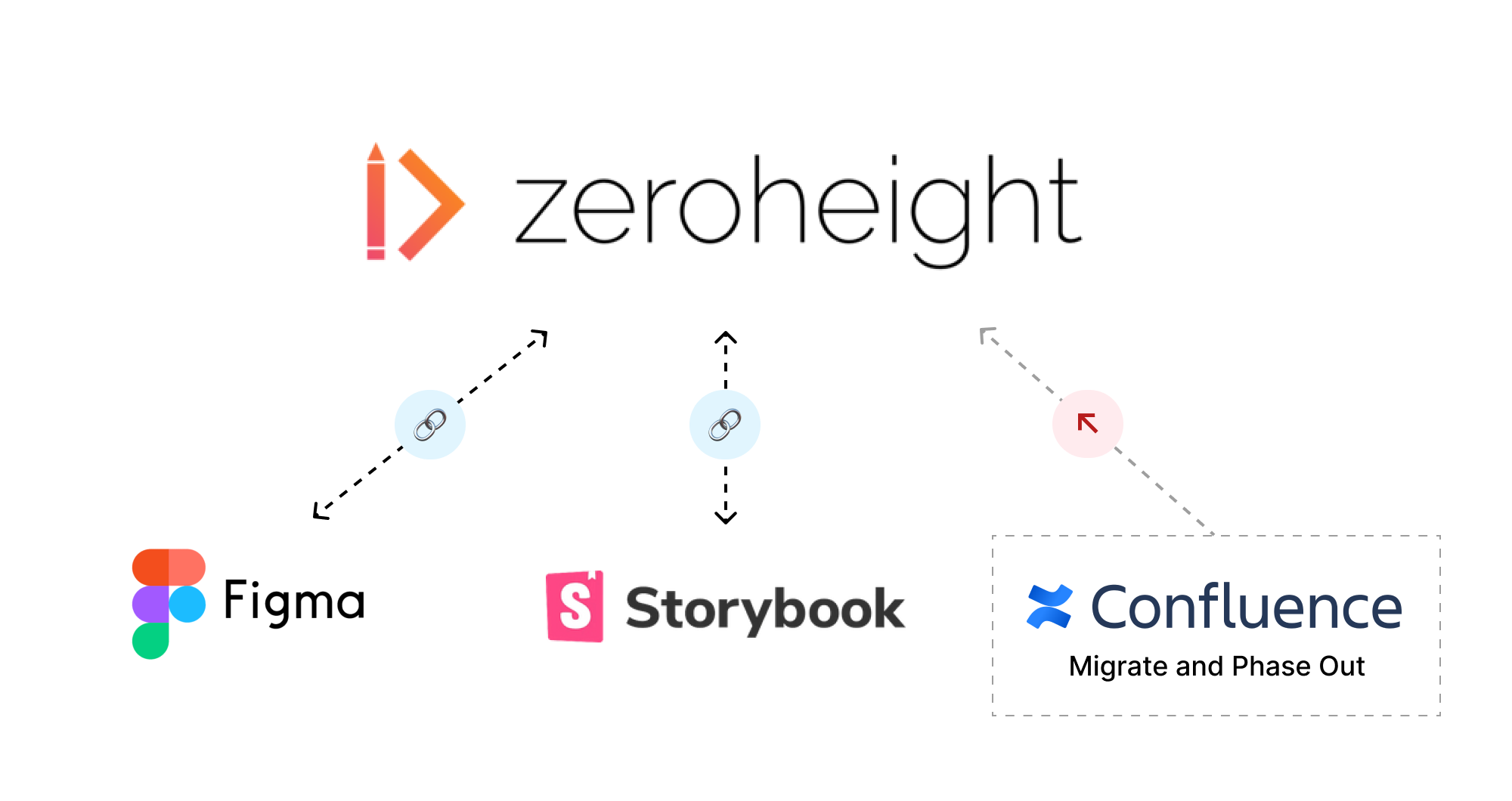
With guidelines originally living in Figma and other design documentation being housed in Confluence, it quickly started to become challenging to navigate these tools to find the right resources.
As a result, I spearheaded the strategy and execution for migrating design system documentation into Zeroheight, evaluating information architecture, content organization, and tool integration to centralize information in source of truth.
The Impact
“I’m getting very positive feedback from sales & SMEs that have started to look at the new UI, congrats to the team for this awesome work!”

“I’m just stopping by to say that the designs you all are making are amazing. I can’t wait to get them all implemented. This is some of the best design/UX work I’ve seen in my career.”
“The component library and pattern guidelines have been excellent and cut down the decision-making time to get a design moving forward.”