Design System for Cybersecurity
A client in cybersecurity recently shifted from services-driven model to Software as a Service. Previously, they’ve tried and failed to start a design system due to limited resources and allocation. As a result, their product continues to be inconsistent in design and development.
My Role
Senior Designer
Team
Lauren Blackburn, Design Lead
Alyssa Sparacino, Designer
Andrea Worthington, Designer
Christine Orsini, Delivery/Scrum

Where did we begin?
In an earlier strategy engagement, it was surfaced through several stakeholder interviews that there was a disconnect in design and development. There was no holistic design direction, resulting in inconsistencies and misuse of components. The breakdown in communication within teams has even resulted in designs getting built before any formal design approval.
Defining a Design Direction
Before we could get to work on building a system, we needed to establish a unified design direction that would serve as a guide for future design decision-making. After creating a series of moodboards, the team executed numerous iterations of foundational design elements such as typography, iconography, surface colors and elevation, etc. in order to get to our Concept Car.
View more details about this process in this case study.
Our Process
-
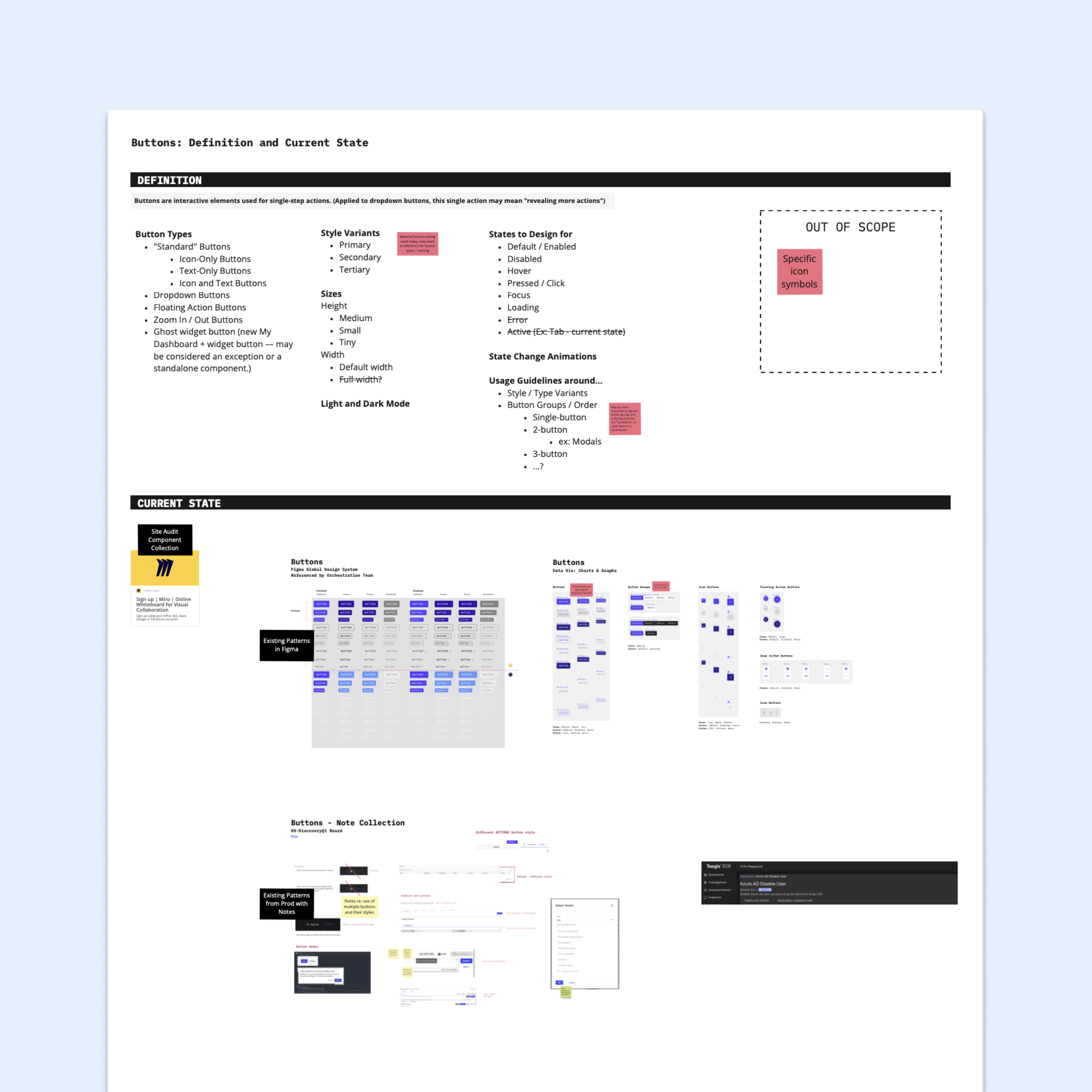
Define
Using component narratives boards, we conducted audits for each component to highlight current usage and identified requirements and questions to be answered prior to the Design phase.
-
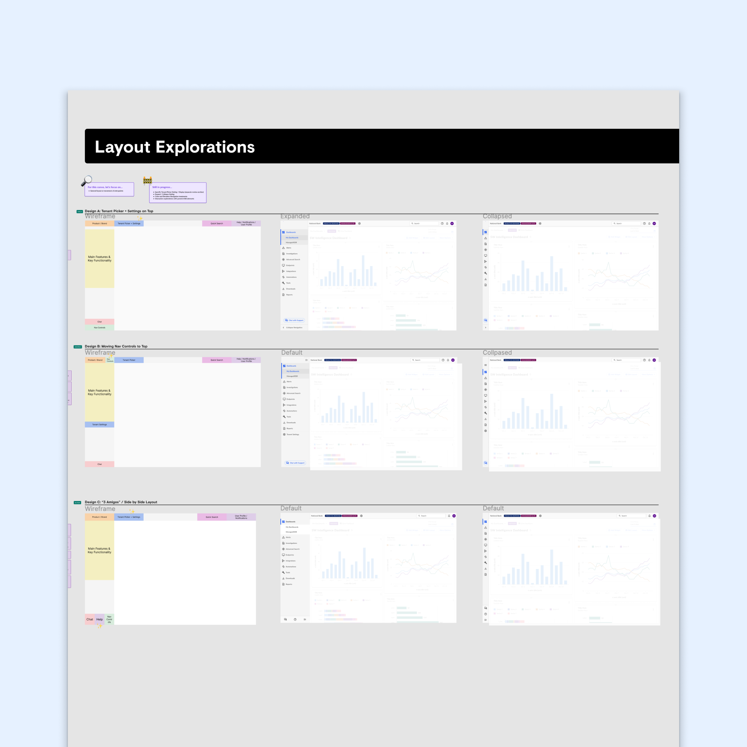
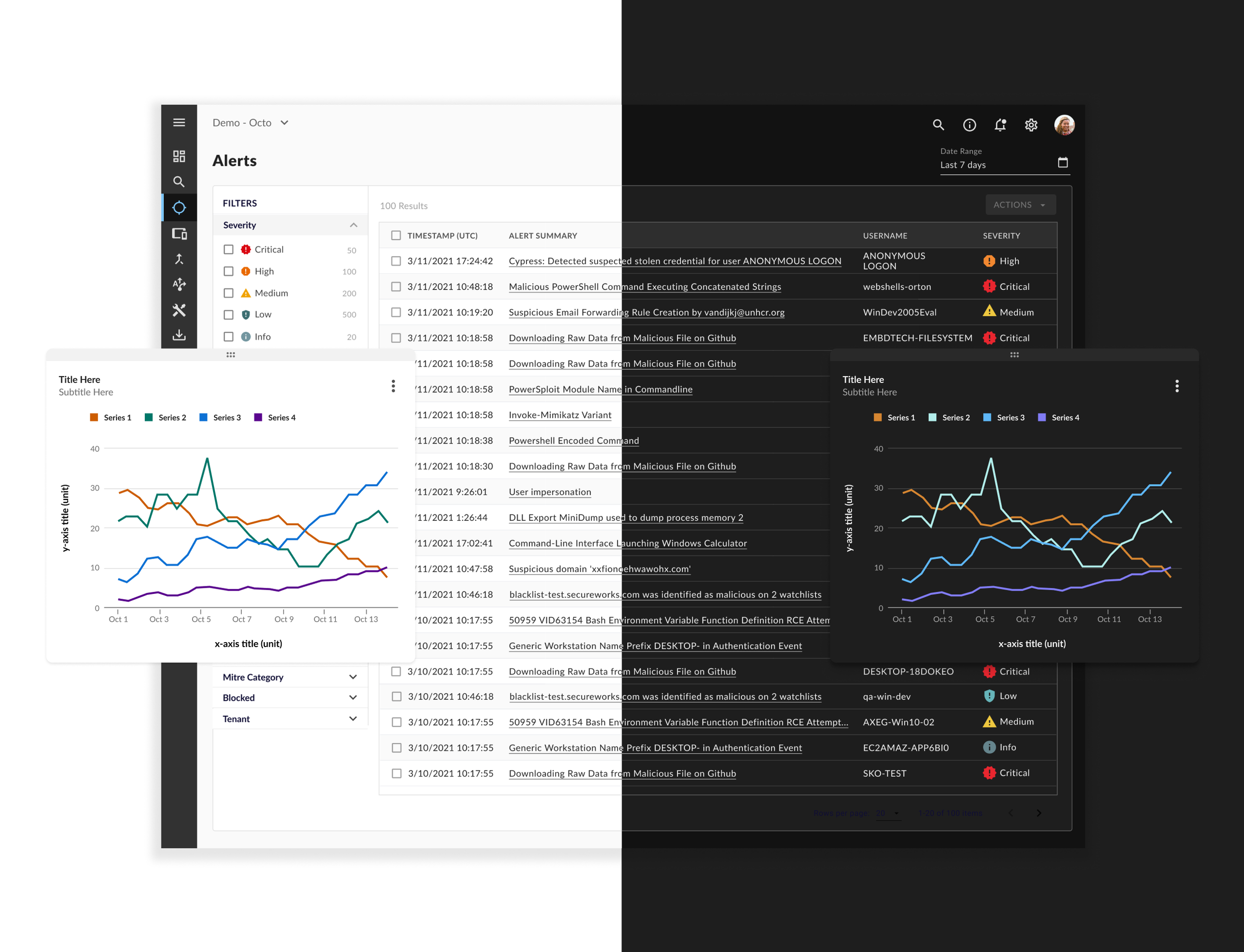
Design
In Figma, we iterated on various design decisions and behaviors for each component, collaborating with client designers and developers along the way.
-

Develop
After final design approval, component specs were outlined in a handoff document, which would later be reviewed with usage guidelines in a component review meeting to answer any remaining questions prior to implementation.
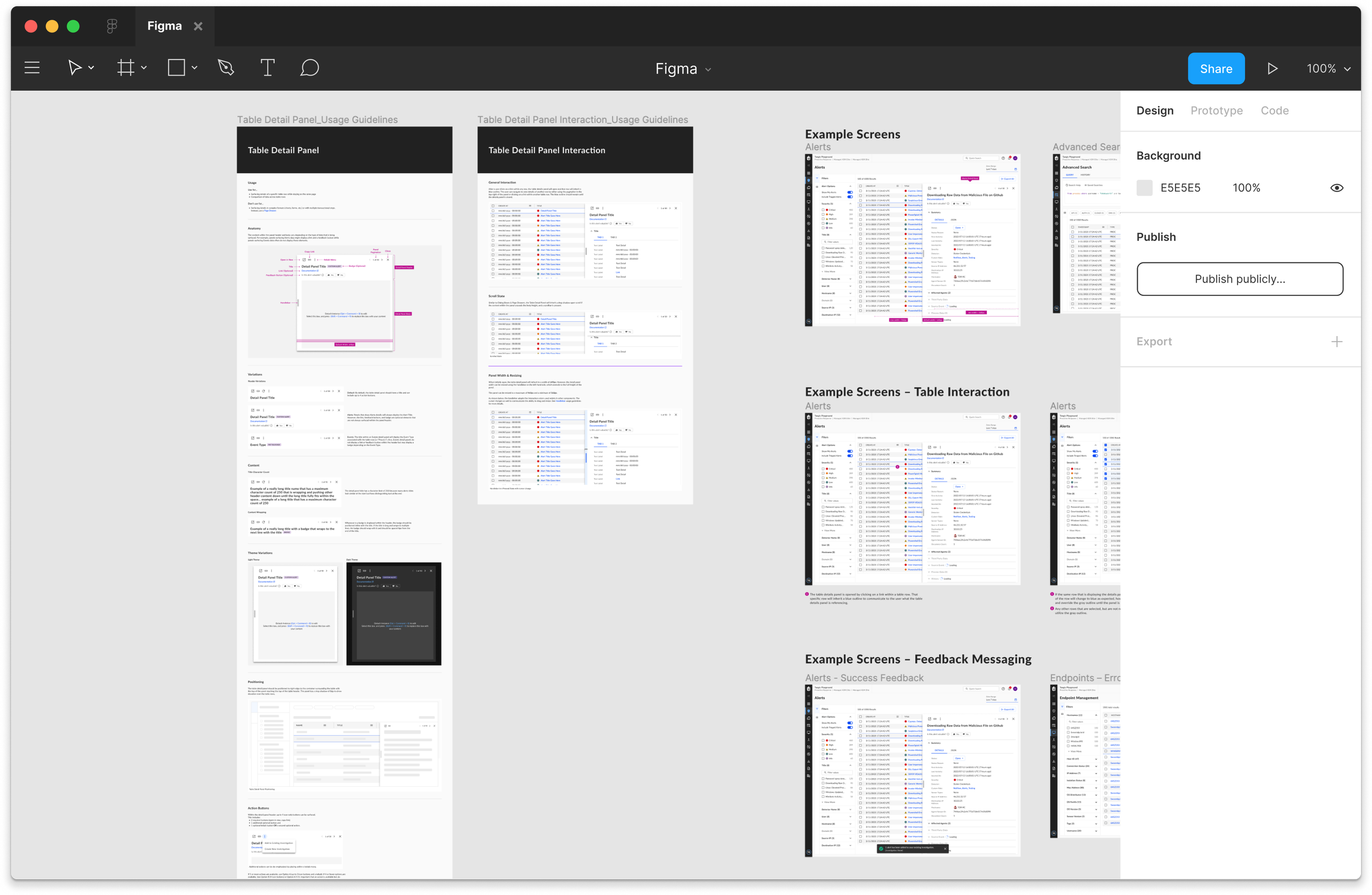
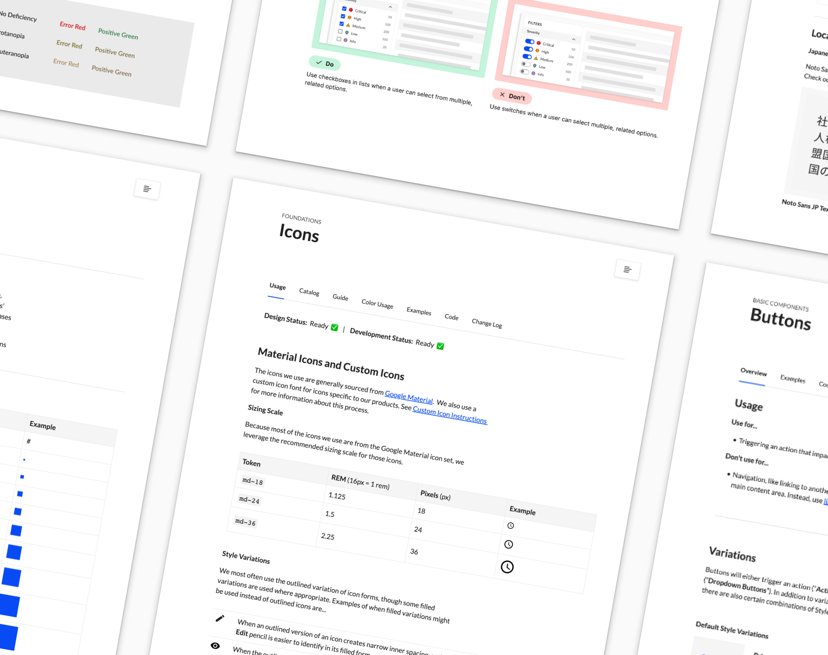
Usage Guidelines
Foundation and Component Guidelines were stored in Figma* and included information about:
Anatomy
Component Variations
Interaction States
Positioning
Do’s / Don’ts
Example Screens were displayed alongside the guidelines to demonstrate common use cases and best practices for utilizing the component.
*Usage Guidelines were later moved to Zeroheight. More on this below.
Training
Once we reached a point where the Design System contained the majority of components needed for version one, the team coordinated training sessions where we focused on the following with client designers:
Addressed skills gaps in design tools
Educated on design system usage
Improved design efficiency
I directed this initiative by creating outlines for the sessions, designing the content, and providing direction to other designers on speaking parts and Figma demos.
These trainings took place in three parts, addressing Usage Guidelines and Libraries, Auto Layout, and Interactive Components and Prototyping.
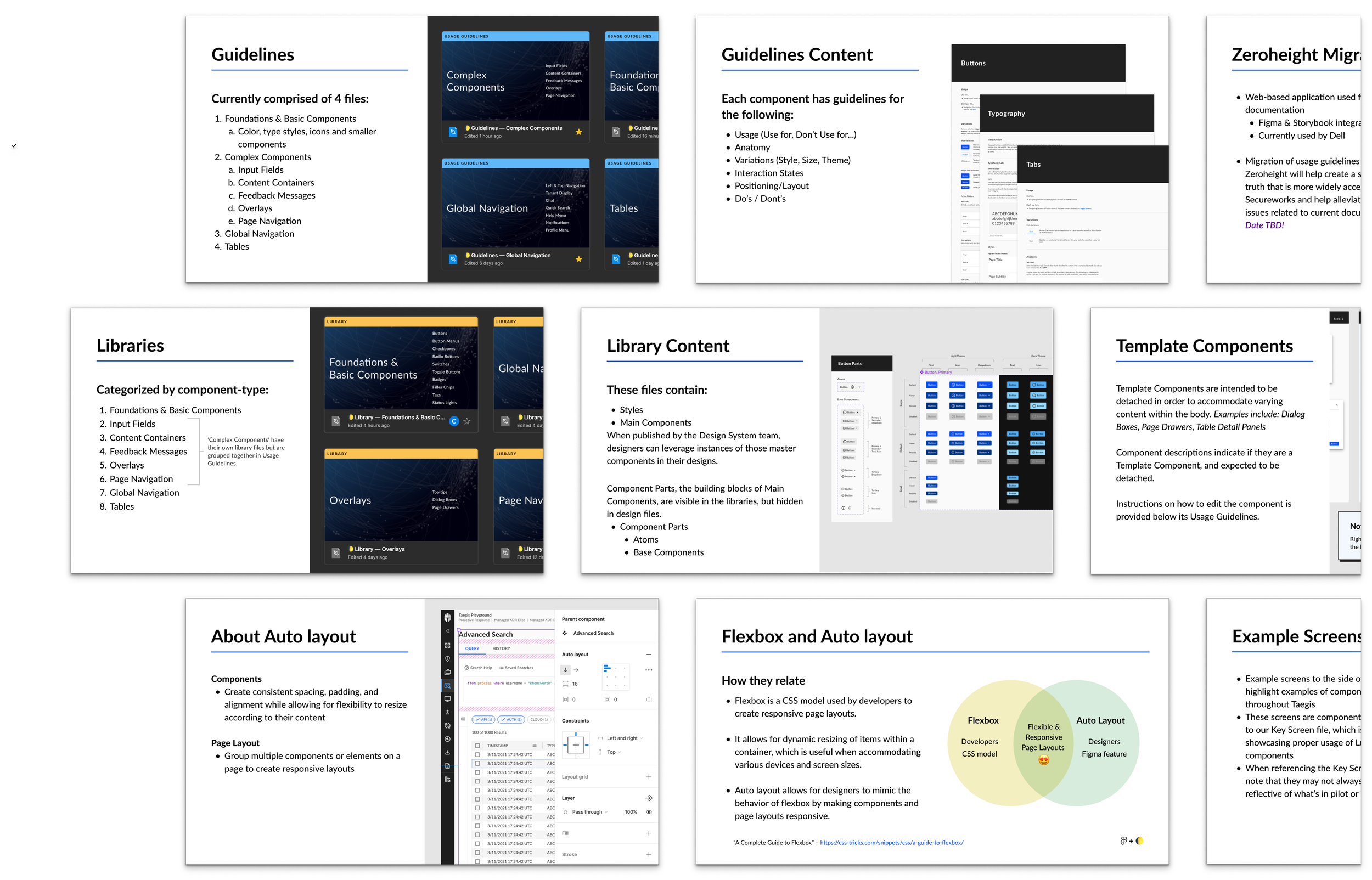
Documentation Migration
Confluence was a primary tool used by the client for various types of documentation and the team had initially adapted to using this tool via plugins to link out to documentation. However, as the system scaled, we realized that the plugins were unreliable and Confluence became difficult to navigate. Maintaining parity between Figma, Storybook, and Confluence became increasingly difficult as well.
The need for a single source of truth became apparent and Zeroheight was a solution that would allow for easy integration of the tools we already use.
Preparing for Migration
In preparation for migration of documentation and guidelines into Zeroheight, I spearheaded the initiative by planning and defining the information architecture and evaluating content organization and tool integration.
-
Planning
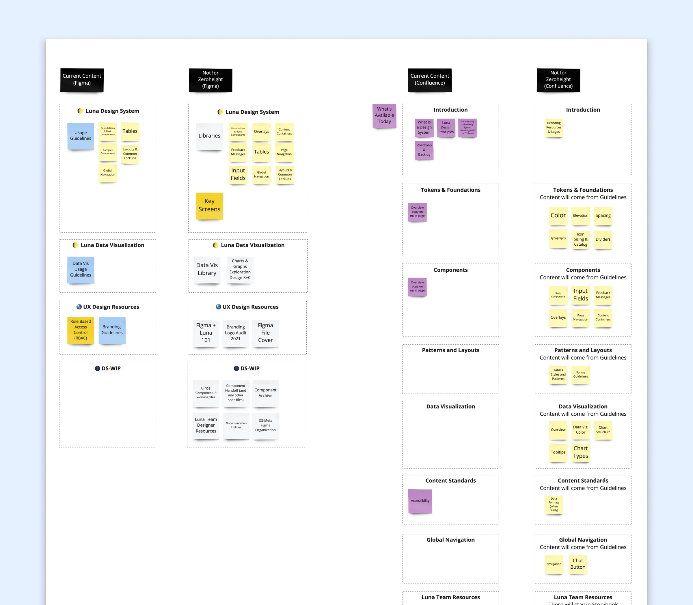
I audited existing Design System content in Confluence and Figma to align on what would get migrated into Zeroheight.
-
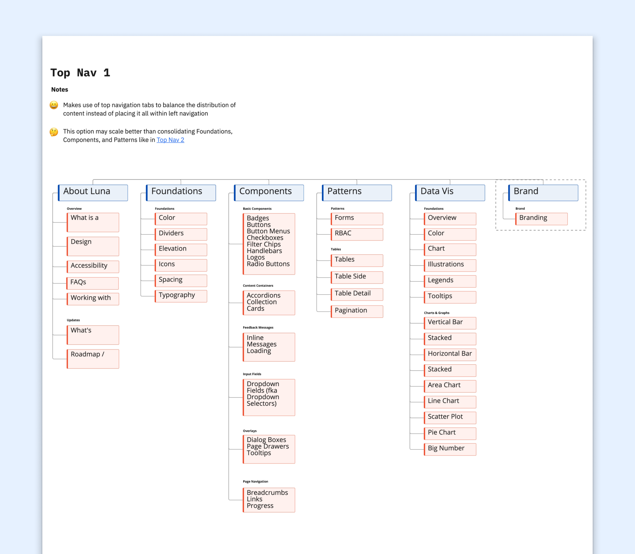
Site Mapping
After auditing, I mapped the Information Architecture that we would use for Zeroheight by exploring various options and considering how each would scale.
-

Versioning
I researched and partnered with our lead in conversations around creating, naming, and managing releases to help the client plan ahead.
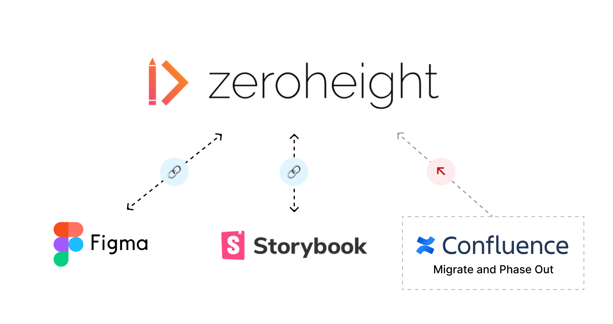
Before, designers and developers needed to navigate Usage Guidelines across several Figma files or find information such as Design Principles or Component Status updates across various Confluence pages.
Zeroheight helped solve for scaling and findability issues by bridging these tools and centralizing the information in one place.

Feedback
“I’m getting very positive feedback from sales & SMEs that have started to look at the new UI, congrats to the team for this awesome work!”
“I’m just stopping by to say that the designs you all are making are amazing. I can’t wait to get them all implemented. This is some of the best design/UX work I’ve seen in my career.”
“The component library and pattern guidelines have been excellent and cut down the decision-making time to get a design moving forward.”
