Information Architecture Redesign
The Healthfirst mobile app was quickly outgrowing its current information architecture (IA) as future features on the roadmap did not have a place within the existing structure. I led the redesign of the new IA to work with existing content and scale for the future.
Tools
Sketch, Miro
Contributions
Strategy, secondary research & competitive analysis, design, prototyping
My Role
Lead designer
Timeline
~4-6 months
Current State
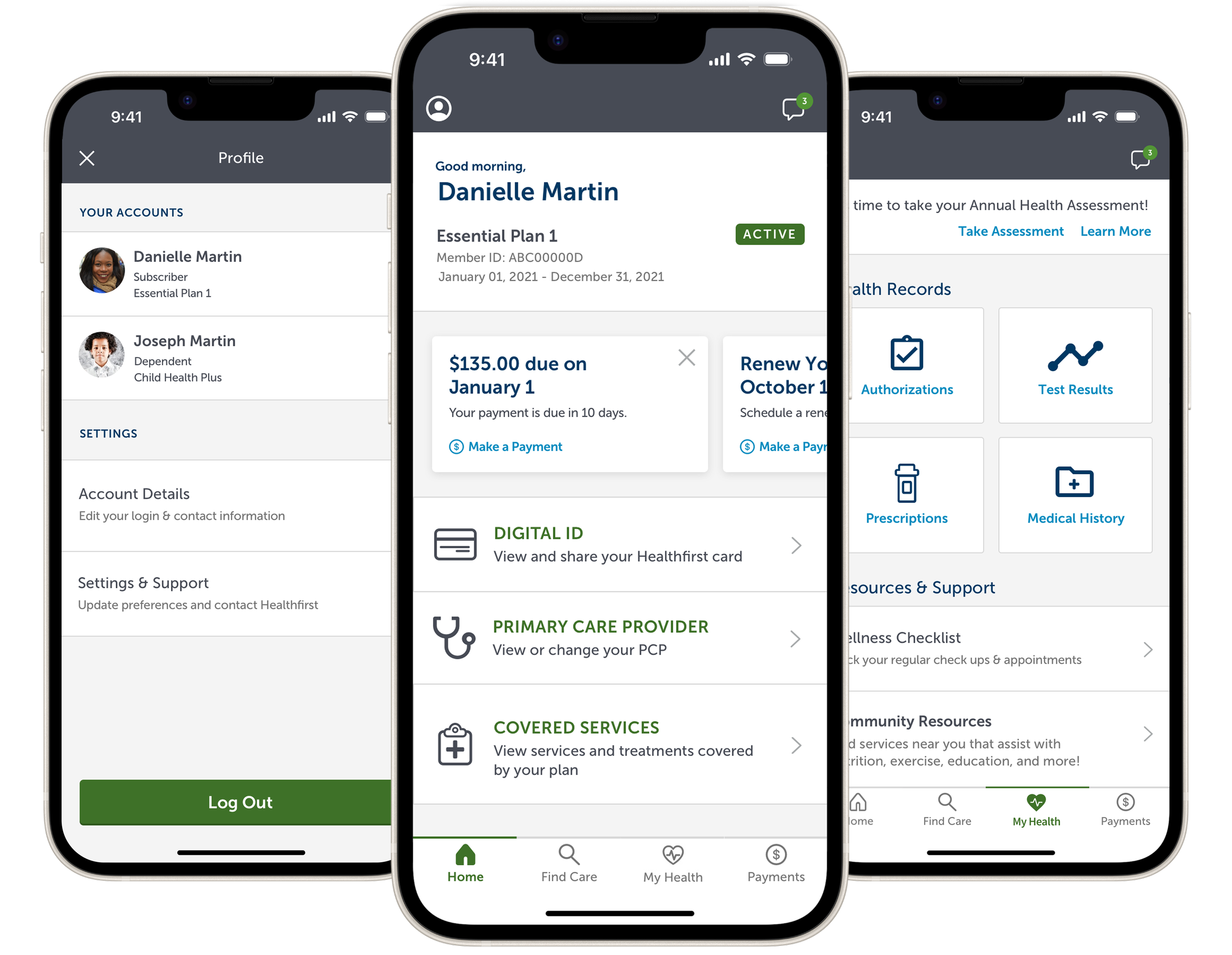
With new features on the horizon, scaling within the app’s current IA was not optimal due to the existing navigation categories and structure. Additionally, the About section of the app was becoming a catch-all for items that had nowhere else to go and the list was growing with little organization.
In research, we’ve also heard that the images seen throughout the app of famous New York landmarks weren’t resonating with members, adding unnecessary visual noise and utilizing valuable navigation space.


Mapping the App
While we would have ideally performed an initial card sort with members, resources for research were limited at the time so, as a team, we performed an internal sort. Using this data, I created a site map of the proposed information architecture based on our assumptions, including existing and future features to account for scalability.

Looking at the Health Space
Before diving into wireframes, I looked at mobile apps of direct and indirect competitors to identify any common patterns or IA structures.
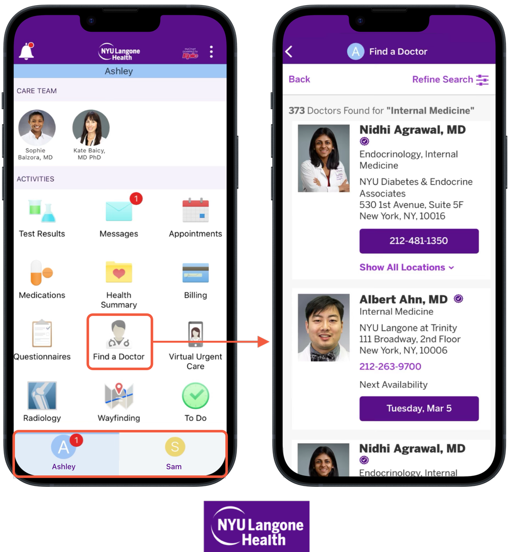
Many health apps, like NYU Langone, are giving their users a lot of choices on the same screen, creating a cognitive burden.
However, there is a clear navigation path back and forth for users, helping establish confidence.
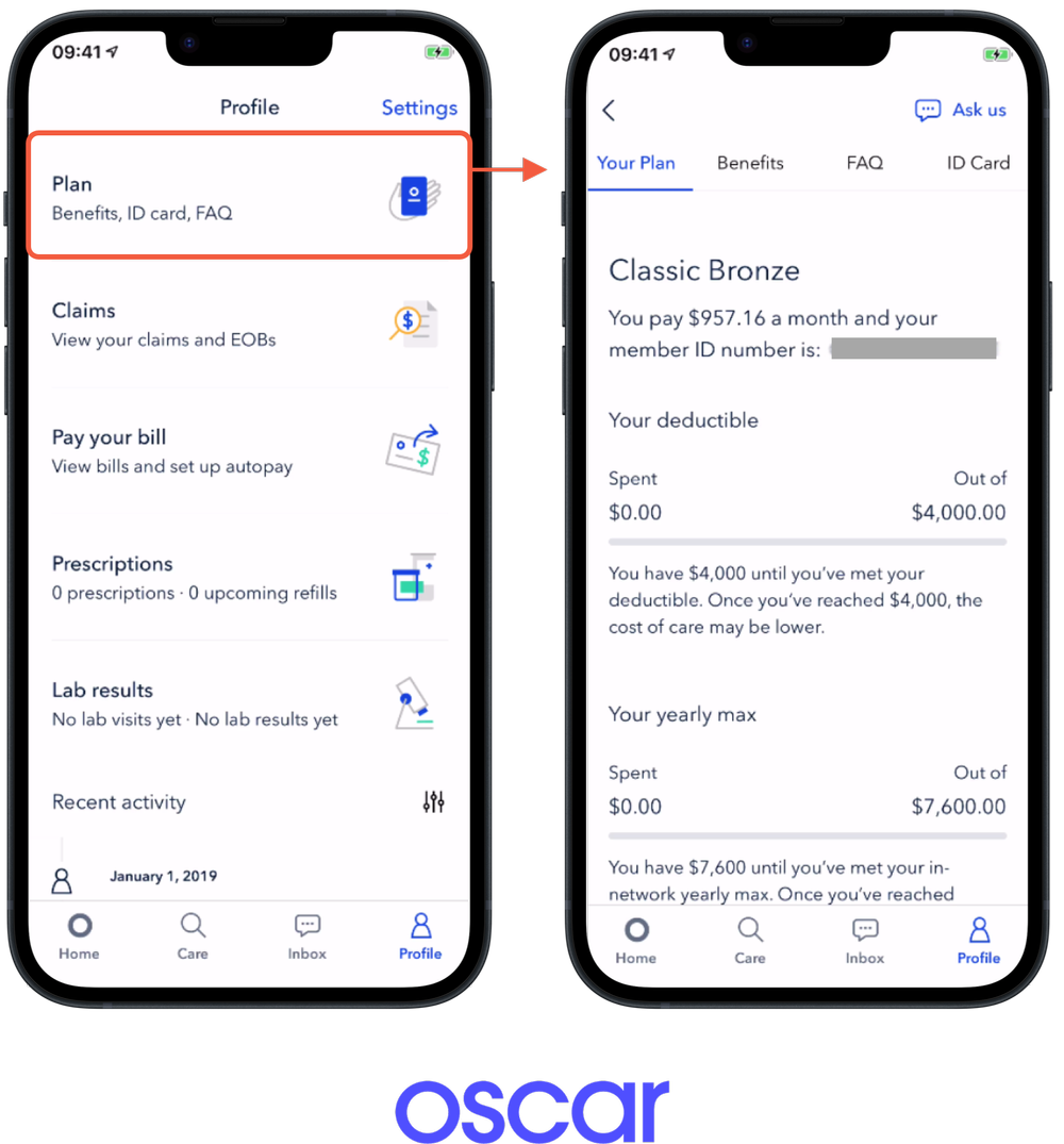
Oscar utilizes Tabbed and Nested Doll navigation patterns effectively to organize information.
Clear and brief descriptions for each feature are also utilized, enforcing the principle of disclosure to assist with decision-making.
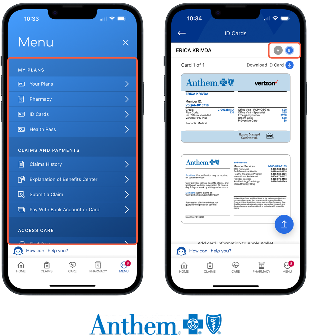
Anthem's app similarly used their More/Menu page as a catch-all of items.
Segmented navigation and filtering is being used to switch between head of household and dependent information, another opportunity we were trying to solve for to avoid any global switching.
Going Mid-Fidelity
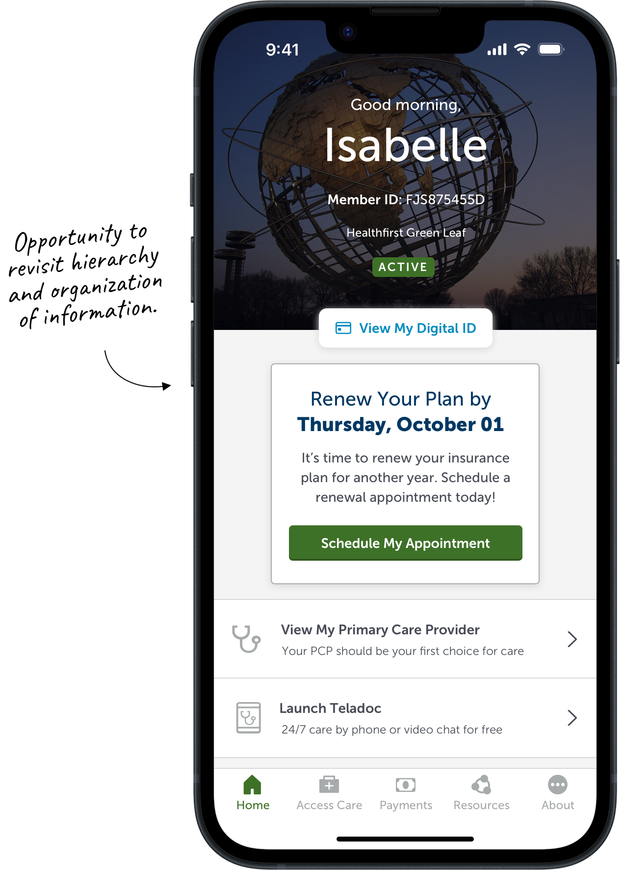
Using my sitemap and competitor research for reference, I redesigned the app to reflect the newly proposed information architecture. In order to scale for future features, I relied on nesting patterns for navigating through content and exercised the Principles of Exemplars and Disclosure through the use of iconography and text descriptions to make content as clear as possible.
Opportunity #1
Utilize Common Touchpoints
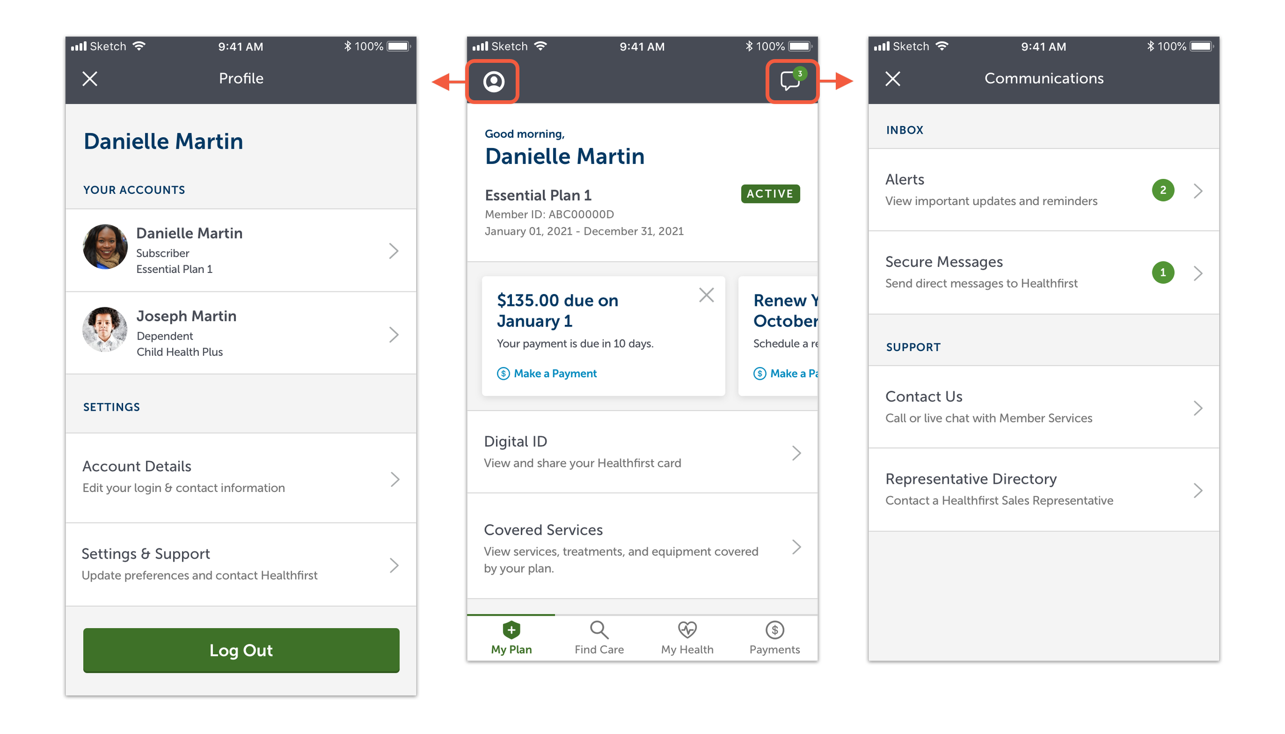
Within the header area, where the New York landmark images once were, are now options to navigate to the Profile or to a Communications center, where Alerts, Messages, and Member Support information can be found.
Opportunity #2
Communicate Effectively
Helping members navigate to the information they’re looking for can be done through text and imagery.
Use iconography and tiles for actions that are common and quick to identify.
Use descriptive text to elaborate on more complex content to prevent the user from navigating where not necessary.

Research
After creating the mid-fidelity designs, it was time to validate our assumptions in research with these main objectives:
Understand mental models that members have when categorizing features to inform current and future information architecture.
Evaluate usability of the proposed IA at a high-level:
Do members interpret the visual hierarchy as intended?
Are members able to find information and take key actions?
🧑
9 Participants
🗂️
Moderated Card Sort
📱
Design Evaluation
Successes
Overall, participants were successful in locating the proper areas of the app to complete various tasks:
🟢 9/9 Participants
“Ask a question to a Healthfirst representative”
⚫️ 7/9 Participants
“Discover an urgent care that your plan covers”
🟣 6/9 Participants
“Review what your insurance covers”
Other successful tasks
“Edit your username” (9/9)
“Pay your monthly premium” (9/9)
“Locate a pharmacy near you” (9/9)
“View your latest notifications” (6/9)

Opportunities
While participants had success in most tasks, there were some that posed difficulty:
🟡 4/9 Participants
“Discover assistance with nutrition in your neighborhood”
Original Location: My Health
Recommendation: Keep under My Health to keep Find Care focused on medical care.
🔴 1/9 Participants
“Change your Primary Care Provider”
Original Location: Find Care
Recommendation: Move to My Plan

Mental Models
Insights from the card sort and design evaluation demonstrated that the proposed info architecture aligned with mental models of members. However, while many of these features were in alignment, there were some future items that would need further consideration and research such as Claims, Community Resources, Authorizations, and Rewards.
*Sitemap reflects data from both card sort and find-ability tasks.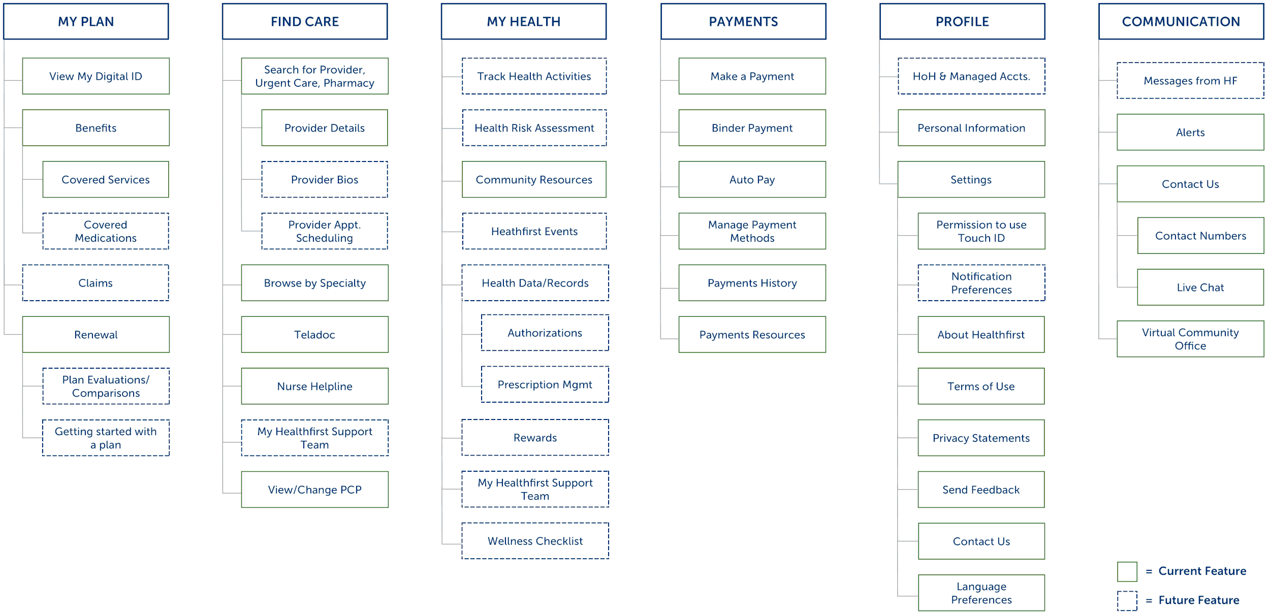
Next Steps
Switching to the new Information Architecture would take some time and designs needed to be brought to a high-fidelity. But I identified some near-term opportunities that would put this transformation on the right track…
Near
Update iconography and verbiage within the tabbed navigation for clarity and orientation.
Keep the main landing screen as “Home” instead of changing to “My Plan” as users were disoriented by the label change and continue to evaluate.
Next
Update the About section to the new Profile and Communication sections found in the top header.


After (mid-fidelity)
Before

Status Update
While my time on this engagement ended before I could further work on these designs, the team carried it forward and the recommendations have since been implemented!